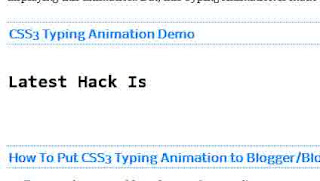
 You might have seen some websites or blogs using this animation. Some of them using gif images for displaying this animation. But, this Typing Animation is made using Pure CSS. Earlier when you want to display this type of animation you have to make a GIF image first but now you can you can display this animation using css no need to use any image in it
CSS3 Typing Animation Demo
How To Put CSS3 Typing Animation to Blogger/Blogspot
- Go to Blogger Dashboard
- Click on DropDown Menu and select Template
- Backup your Template before making any changes to your blog
- Now Click on Edit HTML --> Proceed --> Expand Widget Templates
- Press Ctrl + F and search the code shown below
]]></b:skin>
- Now Paste the Code shown below just before/above it
@-webkit-keyframes typing {
from { width: 0 }
to { width:16.3em }
}
@-moz-keyframes typing {
from { width: 0 }
to { width:16.3em }
}
@-webkit-keyframes blink-caret {
from, to { border-color: transparent }
50% { border-color: black }
}
@-moz-keyframes blink-caret {
from, to { border-color: transparent }
50% { border-color: black }
}
body { font-family: Consolas, monospace; }
h5 {
font-size:150%;
width:16.3em;
white-space:nowrap;
overflow:hidden;
border-right: .1em solid black;
-webkit-animation: typing 17s steps(30, end), /* # of steps = # of characters */
blink-caret 1s step-end infinite;
-moz-animation: typing 17s steps(30, end), /* # of steps = # of characters */
blink-caret 1s step-end infinite;
}
from { width: 0 }
to { width:16.3em }
}
@-moz-keyframes typing {
from { width: 0 }
to { width:16.3em }
}
@-webkit-keyframes blink-caret {
from, to { border-color: transparent }
50% { border-color: black }
}
@-moz-keyframes blink-caret {
from, to { border-color: transparent }
50% { border-color: black }
}
body { font-family: Consolas, monospace; }
h5 {
font-size:150%;
width:16.3em;
white-space:nowrap;
overflow:hidden;
border-right: .1em solid black;
-webkit-animation: typing 17s steps(30, end), /* # of steps = # of characters */
blink-caret 1s step-end infinite;
-moz-animation: typing 17s steps(30, end), /* # of steps = # of characters */
blink-caret 1s step-end infinite;
}
- Now the HTML part
- Copy the code shown below and paste it where you want to show this animation
<h5>YOUR MESSAGE</h5>


No Comments
Click to Add a New Comment