How to add lightbox jquery to add Effects on Images in Blogger


Hi friends, today I will tell you about jquery LightBox plugin that will give an amazing effect on your blogger’s images. This is very simple method which includes adding 3 things in your template 1st is Lightbox jquery 2nd is Some CSS rules and 3rd is addling rel tag to your image so image can work with that jquery script.

How to add lightbox in Blogger Template

  • Go to Blogger Dashboard 
  • In SideMenu select Template
  • Backup your Template before making any changes to your blog
  • Now Click on Edit HTML
  • Press Ctrl + F and search the code shown below
</HEAD>
  • Replace it with
<script src='http://jquery-hosting-blogge.googlecode.com/files/lightbox.js' type='text/javascript'/></HEAD>
  • Now time to add CSS rules
  • Press Ctrl + F and search the code shown below
]]></b:skin>
  • And replace it with
#lightbox{
background-color:#eee;
padding: 10px;
border-bottom: 2px solid #666;
border-right: 2px solid #666;
}
#lightboxDetails{
font-size: 0.8em;
padding-top: 0.4em;
}
#lightboxCaption{ float: left; }
#keyboardMsg{ float: right; }
#closeButton{ top: 5px; right: 5px; }

#lightbox img{ border: none; clear: both;}
#overlay img{ border: none; }

#overlay{ background-image: url(http://1.bp.blogspot.com/-B6R41EjOobU/TrZkBklKcrI/AAAAAAAAEk8/dBzVL1ojJSY/s1600/overlay.png); }

* html #overlay{
background-color: #333;
background-color: transparent;
filter: progid:DXImageTransform.Microsoft.AlphaImageLoader(src="https://blogger.googleusercontent.com/img/b/R29vZ2xl/AVvXsEi40dZ1MCkjciRZqPSHKtjB6qVph84BSri1GQGGHdUbKHuMCRTT3YlDydABjdrjYmakMcRj6_CMUA-eH70Pf1eQgLhm4DZaMRMMeedFK0S_v9Tpt3_Z_eWqPGKPlixMAVq7oq0q21DDbPS7/s320/overlay.png", sizingMethod="scale");
}]]></b:skin>
 

Using the Lightbox in Your Post 

Wherever you want to make use of the Lightbox with your post’s image just add rel rel="lightbox" attribution to the image
For ex. <a href="image-url" rel="lightbox" title="lightbox"><img src="Address.of.image" width="150" Height="160"/></a>


Like it? Share it.

How To Add stylish Ribbon In Your Latest Blogger Post without JQuery

How To Add stylish Ribbon In Your Latest Blogger Post without JQuery
Hi friends, i have already posted about Adding a stylish ribbon to blogger template  . But that was with jquery due to which your website may take more time to load.So today i m here to tell you about adding another stylish ribbon to your blogger template but it is done using CSS not JQUERY so it will not take extra time to load.


Add stylish Ribbon In Your Latest Blogger Post without JQuery

  • Go to Blogger Dashboard 
  • Click on DropDown Menu and select Template
  • Backup your Template before making any changes to your blog
  • Now Click on Edit HTML --> Proceed -->  Expand Widget Templates
  • Press Ctrl + F and search the code shown below
]]></b:skin>
  • Now paste the below code just above it. 
.wrappercbt12
{
  margin: 50px auto;
  width: auto;
  height: auto;
  background: transparent;
  position: relative;
}
.ribboncbt123
{
  font: bold 20px Sans-Serif;
  text-align: center;
  transform: rotate(45deg);
  -o-transform: rotate(45deg);
  -ms-transform: rotate(45deg);
  -moz-transform: rotate(45deg);
  -webkit-transform: rotate(45deg);
  position: relative;
  padding: 7px 0;
  left: -25px;
  top: 7px;
  width: 160px;
  background-image: linear-gradient(top, #129, #12f);
  background-image: -o-linear-gradient(top, #129, #12f);
  background-image: -ms-linear-gradient(top, #129, #12f);
  background-image: -moz-linear-gradient(top, #129, #12f);
  background-image: -webkit-linear-gradient(top, #129, #12f);
  color: #fff;
  -o-box-shadow: 0px 0px 3px rgba(0,0,0,0.3);
  -moz-box-shadow: 0px 0px 3px rgba(0,0,0,0.3);
  -webkit-box-shadow: 0px 0px 3px rgba(0,0,0,0.3);
  box-shadow: 0px 0px 3px rgba(0,0,0,0.3);
}
.ribboncbt-wrapper12
{
  width: 86px;
  height: 88px;
  overflow: hidden;
  position: absolute;
  top: -4px;
  right: -4px;
}

  • Now search for 
<b:include data='post' name='post'/>

  • and replace it with this code. 
<b:if cond='data:blog.url == data:blog.homepageUrl'>
<b:if cond='data:post.isFirstPost == &quot;true&quot;'>
<div class='wrappercbt12'>
<div class='ribboncbt-wrapper12'><div class='ribboncbt123'>NEW</div></div>
<div id='first-post'>
<b:include data='post' name='post'/>
</div></div>
<b:else/>
<b:include data='post' name='post'/>
</b:if>
<b:else/>
<b:include data='post' name='post'/>
</b:if>

  • Now Save the template Hope you enjoy the post don't forget to hit share button seen below. 

Like it? Share it.

Embed small Portion of a YouTube Video in your bog/Website-labnol

Hi Friends,
   After a long time i came to +MBT for writing a post .We all bloggers watch videos on Youtube and embed some videos on our blog/website.But Sometime we want to embed just small portion of video to our blog.To do so we use to download the video edit that in some video editing software and again upload that on Youtube and then embed the video.but now we can bypass all that process and embed only the part of video we want need .so Today am here with a great trick to do so that i found on Labnol Blog by  Amit Agarwal.

Like it? Share it.

How To Add A Stylish Ribbon To Your Latest Post in Bloggers

Hi Friends, you might seen a side ribbon in many blogging template and many of you should have the wish to add this ribbon to your blogger template.So today i am here to tell you how you can add this stylish ribbon right to your blogger template.The main reasons behind using this type of ribbons is that these type of ribbons are more noticbale then anything else.This ribbon will be shown at the right top corner of your posts and will look awesome at your blog .To add this ribbon you just need to copy paste some codes into your blogger blogs template and then refresh your blog to see it live in action.It will work almost in all major browser without having any problem.

Like it? Share it.

Add Mashable Style Popup Social Subscription Box For Blogger And Wordpress

Mashable Style social subscription widget was introduced by Mashable. Earlier i have provide you mashable style social subscribing widget. Now i have put this widget in a Pop Up so that you can use this mashable subscription widget as a pop up. This is similar to another pop up as when a visitor arrives to your blog this widget pop out on visitor computer screen. You can also customize the pop up settings of this widget as after how much time this widget appear, just you have to put the number of days in the widget generator, and then this pop up will appear to your computer screen as you will set on widget generator


Mashable Style Popup Social Subscription Box Demo


Live Demo


How To Add Mashable Style Popup Social Subscription Box For Blogger And Wordpress

  • Click on Widget Generator button shown below
  • Customize the Settings as you need
  • Then click on Generate button then finaly click on Add To Blogger button 
  • For Wordpress users copy the code and paste it inside the widget

Widget Generator

Like it? Share it.

Multi colored Labels Widget For Blogger

Recently i have shared multicolored popular post widget for blogger. Now i had designed this multicolored widget for labels


Different/Multi Colored Labels Widget Demo


Live Demo

How To Add Different/Multi Colored Labels Widget To Blogger

  • Go to Blogger Dashboard 
  • Click on DropDown Menu and select Template
  • Backup your Template before making any changes to your blog
  • Now Click on Edit HTML --> Proceed --> Expand Widget Templates
  • Press Ctrl + F and search the code shown below


]]></b:skin>


  • Now Paste the Code Shown Below just above/before it


#Label1 ul li a:hover{color:#fff;text-decoration:none}
#Label1 ul li a {-webkit-text-size-adjust: auto; -webkit-text-stroke-width: 0px;  color: #333333; display: block; font-family: Georgia, 'Times New Roman', Times, serif; font-size: 13px; font-style: normal; font-variant: normal; font-weight: normal; letter-spacing: normal; line-height: 18px; margin: 0px 40px 0px 0px; min-height: 30px; orphans: 2; padding-top: 10px; text-align: -webkit-auto; text-decoration: none !important; text-indent: 0px; text-transform: none; white-space: normal; widows: 2; word-spacing: 0px;}
#Label1 ul li:first-child:after,
#Label1 ul li:first-child + li:after,
#Label1 ul li:first-child + li + li:after,
#Label1 ul li:first-child + li + li + li:after,
#Label1 ul li:first-child + li + li + li + li:after,
#Label1 ul li:first-child + li + li + li + li + li:after,
#Label1 ul li:first-child + li + li + li + li + li + li:after,
#Label1 ul li:first-child + li + li + li + li + li + li + li:after,
#Label1 ul li:first-child + li + li + li + li + li + li + li + li:after,
#Label1 ul li:first-child + li + li + li + li + li + li + li + li + li:after{position:absolute;top:10px;right:5px;border-radius:50%;border:2px solid #ccc;background:#353535;-webkit-box-shadow:0px 0px 5px #000;-moz-box-shadow: 0px 0px 5px #000;width:30px;height:30px;line-height:1em;text-align:center;font-size:28px;color:#fff}
#Label1 ul li:first-child + li + li + li + li + li + li + li {background:#DF01D7;width:90%}
#Label1 ul li:first-child + li + li + li + li + li + li + li:after{content:"8"}
#Label1 ul li:first-child + li + li + li + li + li + li + li +li{background:#B041FF;width:90%}
#Label1 ul li:first-child + li + li + li + li + li + li + li + li:after{content:"9"}
#Label1 ul li:first-child + li + li + li + li + li + li + li +li +li{background:#F52887;width:90%}
#Label1 ul li:first-child + li + li + li + li + li + li + li + li + li:after{content:"10"}
#Label1 ul li:first-child + li + li + li + li +li{background:#7ee3c7;width:90%}
#Label1 ul li:first-child + li + li + li + li + li:after{content:"6"}
#Label1 ul li:first-child + li + li + li + li + li +li{background:#f6993d;width:90%}
#Label1 ul li:first-child + li + li + li + li + li + li:after{content:"7"}
#Label1 ul li:first-child + li + li + li + li{background:#33c9f7;width:90%}
#Label1 ul li:first-child + li + li + li + li:after{content:"5"}
#Label1 ul li:first-child + li + li + li{background:#c7f25f;width:90%}
#Label1 ul li:first-child + li + li + li:after{content:"4"}
#Label1 ul li:first-child + li + li{background:#ffde4c;width:90%}
#Label1 ul li:first-child + li + li:after{content:"3"}
#Label1 ul li:first-child + li{background:#ff764c; width:90%}
#Label1 ul li:first-child + li:after{content:"2"}
#Label1 ul li:first-child{background:#ff4c54 ;width:90%}
#Label1 ul li:first-child:after{content:"1"}
#Label1 ul{margin:0;padding:0px 0;list-style-type:none}
#Label1 ul li{position:relative;margin:6px 0;border-radius:25px 0px 25px 0px;border:2px solid #f7f7f7;-webkit-box-shadow:3px 3px 3px #000;-moz-box-shadow: 3px 3px 3px #000;padding:10px}


  • Save your template
  • Now Go to Blogger Dashboard 
  • Click on DropDown Menu and select Layout
  • Create new label widget and click on selected labels and choose up to 9 labels
  • Then click on save button

Like it? Share it.

CSS3 Round Buttons for Blogger

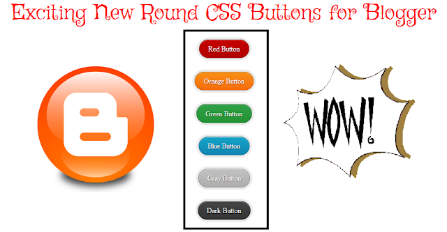
CSS has become a integral part of a good looking blog.We designing is very important so as to leave a mark on your readers.A good looking site is always remembered by a reader.In order to get your readers attention their are certain tricks and tweaks by which you will be able to leave that WOW impression.There are some widgets which make use of CSS.These widgets have become very common and hence they are not that appealing.Their should be some element of surprise in your blog.Some blogs rely on external linking.Buttons are way better than the simple text links.Adding of buttons in your blog is not that difficult a task.Today I am going to show you a simple method by which you will be able to add the exciting new round cornered CSS buttons.These buttons are very easy to use.So let's go ahead and cut the cake.


Features  

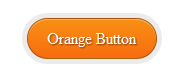
  • Available in different colors
  • Small Coding
  • Hover Effect 
  • Bevel Effects used for active mode
  • CSS 3 is used ( Latest version of CSS ) 
  • Causes no delay in web page load time

CSS3 Round Buttons Demo


Live Demo


Adding the CSS  

  • Go to Blogger Dashboard 
  • Click on DropDown Menu and select Template
  • Backup your Template before making any changes to your blog
  • Now Click on Edit HTML --> Proceed --> Expand Widget Templates
  • Press Ctrl + F and search the code shown below


]]></b:skin>


  • Now Paste the Code shown below just before/above it

/* Exciting Round Buttons By YOURPCGENIE.NET*/
.excitinground{ background: rgba(0, 0, 0, .08); display: inline-block; padding: 5px; border-radius: 30px; -moz-border-radius: 30px; -webkit-border-radius: 30px; }
.excitinground a { color: #fff; border: 1px solid rgba(0, 0, 0, .3); display: inline-block; padding: .6em 1.2em; position: relative; text-decoration: none; text-shadow: 1px 1px 1px rgba(0, 0, 0, 0.5); border-radius: 30px; -moz-border-radius: 30px; -webkit-border-radius: 30px; box-shadow: inset 0 1px 0 rgba(255, 255, 255, .4); -moz-box-shadow: inset 0 1px 0 rgba(255, 255, 255, .4); -webkit-box-shadow: inset 0 1px 0 rgba(255, 255, 255, .4); }

.excitinground a.red { background: #c60000; background: linear-gradient(top, #c60000 0%, #b20000 100%); background: -moz-linear-gradient(top, #c60000 0%, #b20000 100%);
background: -webkit-gradient(linear, left top, left bottom, color-stop(0%, #c60000), color-stop(100%, #b20000)); background: -webkit-linear-gradient(top, #c60000 0%, #b20000 100%); }

.excitinground a.orange { background: #f99015; background: linear-gradient(top, #f99015 0%, #f76c0f 100%); background: -moz-linear-gradient(top, #f99015 0%, #f76c0f 100%); background: -webkit-gradient(linear, left top, left bottom, color-stop(0%,#f99015), color-stop(100%,#f76c0f)); background: -webkit-linear-gradient(top, #f99015 0%,#f76c0f 100%); }

.excitinground a.green { background: #30a146; background: linear-gradient(top, #30a146 0%, #249334 100%); background: -moz-linear-gradient(top, #30a146 0%, #249334 100%); background: -webkit-gradient(linear, left top, left bottom, color-stop(0%, #30a146), color-stop(100%, #249334)); background: -webkit-linear-gradient(top, #30a146 0%, #249334 100%); }

.excitinground a.blue { background: #16a4c8; background: linear-gradient(top, #16a4c8 0%, #1086b6 100%); background: -moz-linear-gradient(top, #16a4c8 0%, #1086b6 100%); background: -webkit-gradient(linear, left top, left bottom, color-stop(0%, #16a4c8), color-stop(100%, #1086b6)); background: -webkit-linear-gradient(top, #16a4c8 0%, #1086b6 100%); }

.excitinground a.gray { background: #c2c2c2; background: linear-gradient(top, #c2c2c2 0%, #aeaeae 100%); background: -moz-linear-gradient(top, #c2c2c2 0%, #aeaeae 100%); background: -webkit-gradient(linear, left top, left bottom, color-stop(0%, #c2c2c2), color-stop(100%, #aeaeae)); background: -webkit-linear-gradient(top, #c2c2c2 0%, #aeaeae 100%); }

.excitinground a.dark { background: #464646; background: linear-gradient(top, #464646 0%, #343434 100%); background: -moz-linear-gradient(top, #464646 0%, #343434 100%); background: -webkit-gradient(linear, left top, left bottom, color-stop(0%, #464646), color-stop(100%, #343434)); background: -webkit-linear-gradient(top, #464646 0%, #343434 100%); }

.excitinground a:hover, .excitinground:hover { color: #fff; opacity: .7 }

Using the Buttons in Your Post 

Wherever you want to make use of the buttons in your post select any one of the below code that might interest you.The color names indicate the color of the button.Later you can replace the color names by your own text.


<span class="excitinground"><a class="red" href="http://www.YOUR-LINK-HERE.com/">YOUR TEXT</a></span>
   

<span class="excitinground"><a class="orange" href="http://www.YOUR-LINK-HERE.com/">YOUR TEXT</a></span>

<span class="excitinground"><a class="green" href="http://www.YOUR-LINK-HERE.com/">YOUR TEXT</a></span>
<span class="excitinground"><a class="blue" href="http://www.YOUR-LINK-HERE.com/">YOUR TEXT</a></span>
<span class="excitinground"><a class="gray" href="http://www.YOUR-LINK-HERE.com/">YOUR TEXT</a></span>
<span class="excitinground"><a class="dark" href="http://www.YOUR-LINK-HERE.com/">YOUR TEXT</a></span>

 Customizations 

  •  Replace http://www.YOUR-LINK-HERE.com with your own link/ url.
  • Also change YOUR TEXT with the text you want to display 


I hope these buttons were useful for you.These buttons are a result of tedious efforts.Please do appreciate them by sharing this post with your friends / relatives etc Also leave your views below and help me understand your joys and sorrows.


This article was written by Tanmay Kapse of Genie Land

Like it? Share it.